For a few months now, Longhouse has been working with a new partner, Lucas Geomatics.
Lucas Geomatics is a surveying company that offers a number of different services such as Bulk Earthwork Surveys, Site and Services Preparation Surveys and Project Management Surveys.
Our Challenge: Complete Branding Make-Over and Creative Web Development.
When working with Lucas Geomatics, we were essentially giving them a complete brand make-over.
When starting out with branding, a strong foundation needs to be created, which usually refers to the logo. With logo design, there are a few major key things we want to keep in mind.
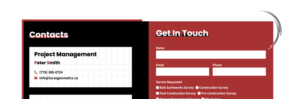
When Web Developing this project, the goal is to create an easy user-friendly website that communicates the services of this business clearly and directly to the customer.
Along with the content of the website, there is also the visual aspect that is just as important. When combining all elements together, creating something that is visually appealing is something to keep in mind throughout the site.
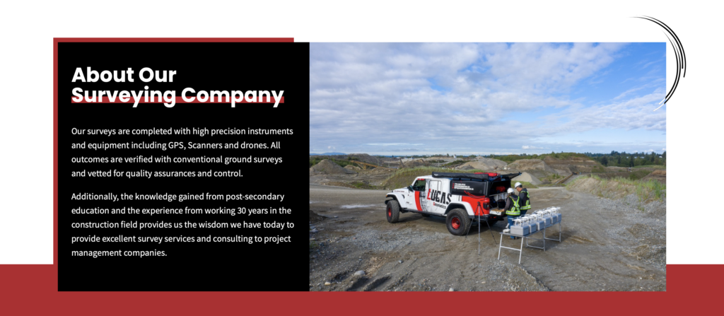
You can accomplish this by adding relevant/ personal photos of your work, team, environment etc. As well as keeping consistent colours and relatable design elements. For example, if you are a Clean Water Energy Company, adding water droplets as a design element to your template is an acceptable decision along with using the colour blue; but moving on to our solution.
The Solution: Creative Logo Design, Thoughtful Branding and Detailed Web Design.
When starting off with that foundation piece, the logo is something that we love to create especially with the more creative control.
Whenever you are creating a logo, there are a few key element that you should consider while creating.
- Font- There are an endless number of font styles out there so searching for the right one will make all the difference. Fonts by themselves set a certain tone or personality for the business which will read directly to the customer.
- Colour- For some businesses, their brand colour may already be chosen but if you are starting fresh or re-branding, considering colour theory and the meaning behind colours; it can go a long way.
- Relevance- Logos can sometimes be just some text themselves, a symbol or both. Whatever was you decide to create, the branding of the logo needs to read relevant to your business and what you do. This can go back and relate to the font you choose, the colours you use or even the symbols you decide to create/use in association to your brand.
- Integration Potential- when designing the logo, its good to always think of the future potential it can have when integrating it with other platforms for your business/branding. There could be small elements that you have decided to include in your logo that can translate into great design assets for your website etc.
While sometimes, creating something that is simply visually appealing and ‘pretty’ can be nice, having more of a thought and reason behind the design can do some good making your business, its brand and quality that much better.
When designing for Lucas Geomatics, they had the vision and idea to create something simpler than their original logo. Had a design icon that was created by combining the two letters ‘L’ and ‘G’ and adding an earth icon in the back. This was then also paired up with text that stated the business’s name. You tell by the image below that the quality and design of this logo is quite old and maybe even slightly outdated.
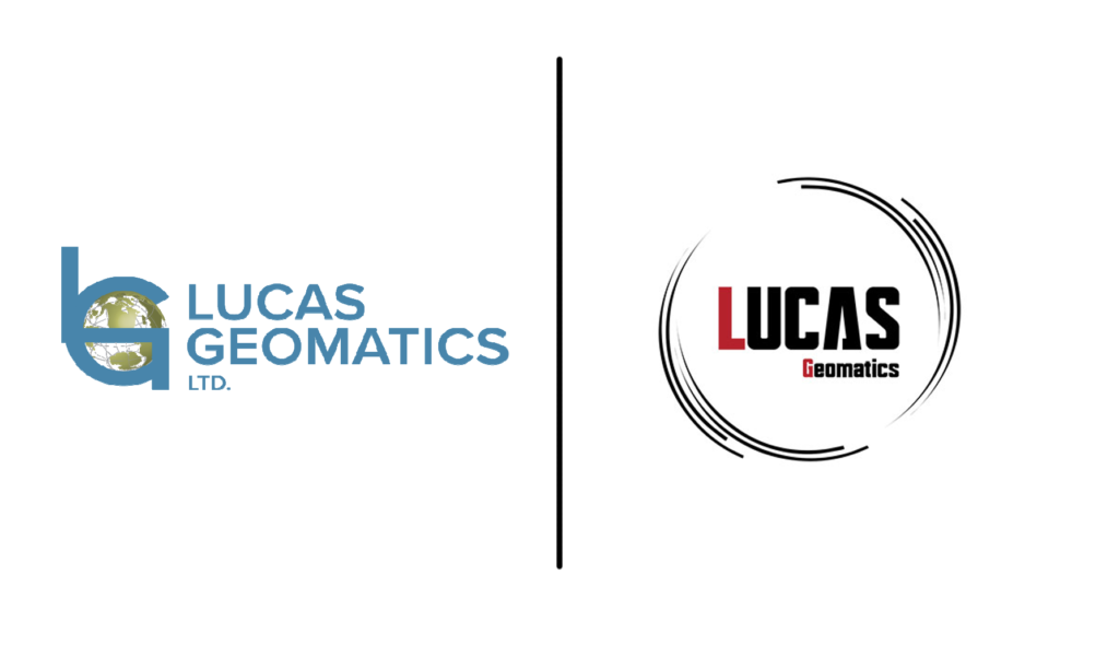
With the new design, we focused on making the font/name the important piece of the logo. With careful font selection and colour change, we were able to transform Lucas Geomatic’s old logo to what it looks like now.
You’ll also notice how our design team decided to add in the linework as an element in replacement of the 3D earth graphic from the original logo. With this, we are still keeping the original design idea intact but with a new look.
This logo was put to more use than just on the site. We were
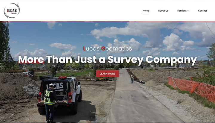
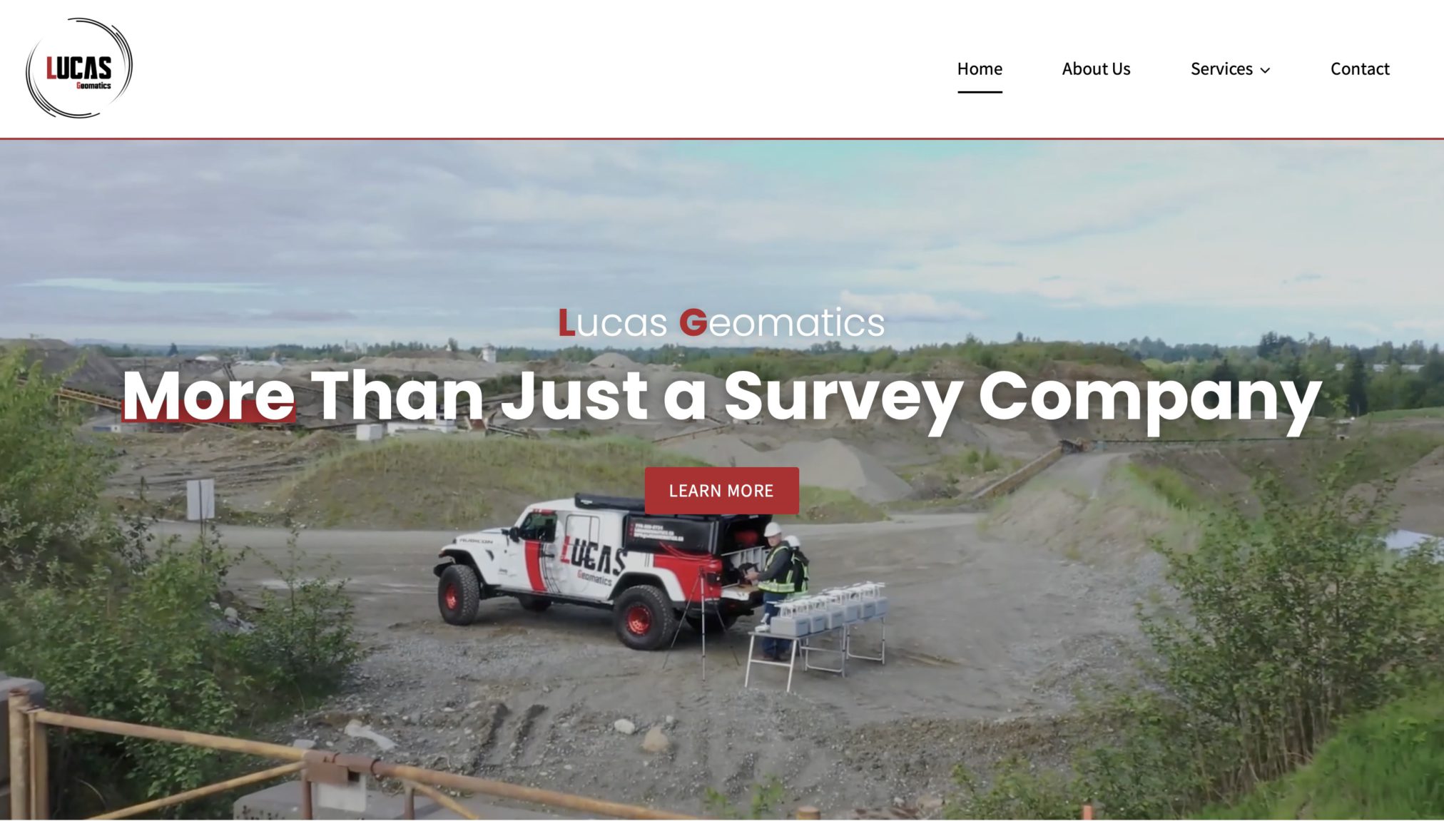
When moving into the Website Design, the basic ‘skeleton’ has been laid out in the sense of colours and the appropriate design elements that we should include; the rest was up to our Web Design team to create.
Starting off with that Home Page, we have our lovely video header. For people who may not be familiar with the kind of work that Lucas Geomatics does, this video header can highlight a visual to site-viewers. As you make your way through the site, the colours, pulled from the logo bring the branding altogether along with the personalized photos etc.
You’ll notice that throughout the site, our design team had incorporated the linework from the logo into all parts of the design.
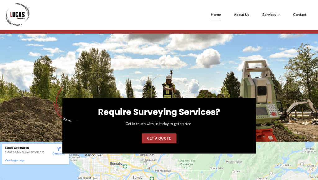
Not only is the design within the template on the site but our team creatively incorporated it into the loading feature.
The Results of Re-Branding With Lucas Geomatics.
The team from Longhouse Media is happy to report great feedback has been received from our new partner and we look forward to maintaining a long-term working relationship with them!